Top tier learning environments
The best classrooms of SHS
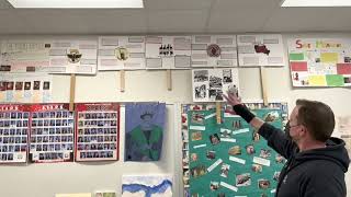
Social Studies teacher David Luers gives a room tour Feb. 25. He won best classroom for the category “decorations.”
While roaming the halls of SHS, you will find over 100 rooms each adorned in different ways. Some strike you with their comprehensive layout, others set you at ease with their low lighting and some help you to focus by giving you the freedom to situate yourself in whatever works for you.
During the production of issue 6, The Journal sent out a Google Form to all SHS students to vote on which classrooms they think are best. As many students haven’t had an opportunity to take classes with a variety of teachers, we have limited the options to 20 rooms in total, each categorized by their defining features.
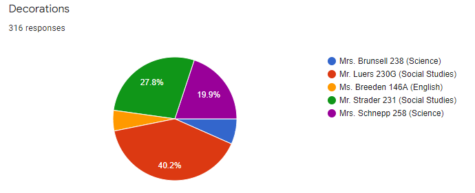
The first category is “Decorations.” The first nomination was Julie Breeden for her mural, framed artwork, 3D artwork and the list goes on. In the final vote, her classroom came in fifth place, last. But, she had some fierce competition. The second was Rachel Brunsell for her inviting lighting that cast a blue hue upon the earth science posters lining the walls. This room grabbed the second-to-last place, fourth. Next up was Amanda Schnepp for her eye-catching “Wall of Fame,” the preserved hornets’ nest and the wonderful display of artwork by former AP Biology students on her ceiling tiles. This science room surmounted to third place. The third nominee was Aaron Strader for his wallpaper of artwork and magazine clippings lining nearly every inch of the walls. His classroom came in 2nd place, a close opponent to Schnepp.
And last but not least, David Luers. His social studies classroom was nominated for the various student projects, the AP exam “Wall of Fame” and the personal aspect of his room. In the corner directly across from the entrance you’ll find a wall of S.T.A.R.S. plaques and a book-shelf buckling under the weight of the knowledge it holds. His personality is exemplified in this small nook, and that is what won him first place.
Senior Lillian Prawat, who has taken three of his classes, says her favorite part about Luers’ room is “the absolute chaos behind his desk.”
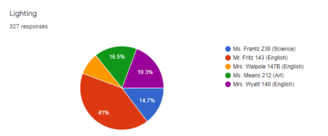
Lighting is our second category, and arguably the most important in a school of limited natural light. As many more teachers have external windows than those without, this category is based on artificial lighting. First up, Jessi Walpole for her array of lighting options. Her strung fairy lights, different lamps and reading light earned her the nomination. However, this room came in last place. Our second nominee was Rachel Frantz for her teenage-esque inspirations. Lining her walls are color-changing LED lights, a funky addition to an already great room. Her room won fourth place but was neck-in-neck with Cierra Means. Means was nominated for her use of string lights lining her ceiling. The fourth nominee was Paige Wyatt. Her plethora of light sources make the room dynamic and relaxing. Her room surmounted to second place.
Jacob Fritz was the last nominee. With his aesthetically pleasing strung Edison light bulbs, walking into this classroom takes the strain off your eyes and puts warmth in your heart. His classroom is in first place by a near landslide with over 40% of the votes.
“A lot of classrooms I’ve been in are very depressing… But the warm lighting makes it easier for me to focus,” one current student of Fritz, sophomore Mohit Baidwan said.
The third category is flexible seating. Many students get a better, or more enjoyable learning experience from flexible seating.
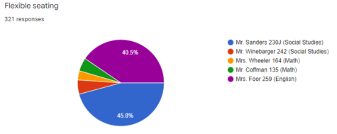
And, many teachers are accommodating to that. The first nomination was Mary Wheeler for her walls lined with reclining couches. She came in fifth place, and was nearly a tie with Lloyd Winbarger and Ethan Coffman. Next is Coffman for his couch and understated room. He came in fourth place. The third nominee, Winebarger, was nominated for his hodge-podge of chairs. From classic desk chairs to spinning office chairs to multiple couches, Winebarger has it all. His classroom ended up in third place. Our second to last nominee is Tara Foor. Her classroom could have fit in a multitude of categories but when you walk into her room, it’s hard to resist propping your feet on a rolling rest or getting comfortable in her booth seats. Even with all her seating options, she still came in second place.
The last nominee and the winner of the category by a 4.5% margin, was Kevin Sanders. His room is brimming with couches and all other seats imaginable. You could even make yourself comfortable on the floor with one of his many area rugs.
“It’s very comfortable, he has a lot of pieces,” senior Miguel Santiago, a student in his iPass said. “He decorates it nicely.”
 Now, the last of 4 categories, space and location. The first nominee, Sara Berghoff, for her SPTV equipped room. She came in fifth place. Second, Mark Snodgrass for all his tech, gadgets and gizmos. This room is home to the SHS Robotics team and it came in fourth. The third nominee is Kimberly Roberts for her proximity to all things theater, very fitting as she is the theater teacher. She came in third place. Our fourth nominee and second place winner was Sam Hanley. He was nominated for his sink, windows, storage room, location and many more defining features.
Our last nominee and landslide winner was Mike Klopfenstein for his enormous room, his secluded location and his extra amenities scattered throughout the room. For all the great physical aspects of room 400, the people in it are what make it special.
“This room feels like a living room. Honestly anyone in here feels like family,” senior Bridget Cagle, Entertainment Editor on The Journal said.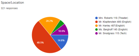

Nearly three years ago, on a fateful day in the spring of my freshman year I voted “Yes” on a Journal instagram poll about interest in making graphics....


